*** Designing in Zero Gravity ***
Category: Exhibition
Year: 2020
Mentors: Brad Bartlett, Roy Taytum, Chris Taylor, Sharon Park
How will dancers perform in space? How will scientists do lab experiments without work tables? How will artists pursue crafting in zero gravity? How can exercise, gastronomy, research, and other uniquely human endeavors be reimagined for the unique environment of space? These are the questions driving projects aboard space exploration and on earth.
This Exhibition showcases remarkable people from many different practices including photography, architecture, flight research, and painters from the 70’s ) that imagined a world in zero gravity.
(This is a hypothetical student project done at ArtCenter College of Design.)
Poster Series: When we think of space, we think of cold, mechanical, and almost no life (that we know of yet). The bold custom type was created to give the feeling of the familiar with the unfamiliar. We can all relate to these letterforms, but when affected by zero gravity, would they remain static or react?

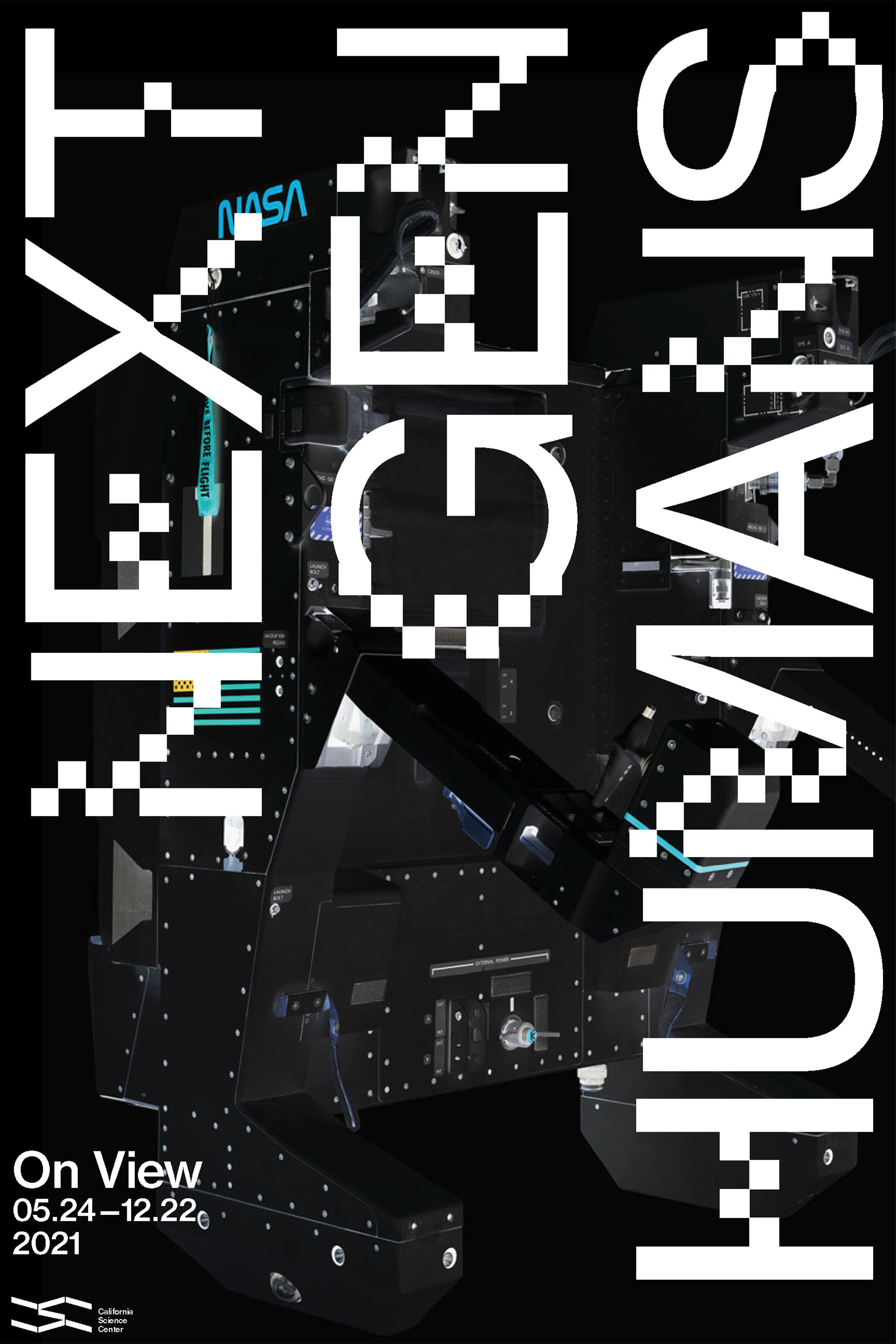

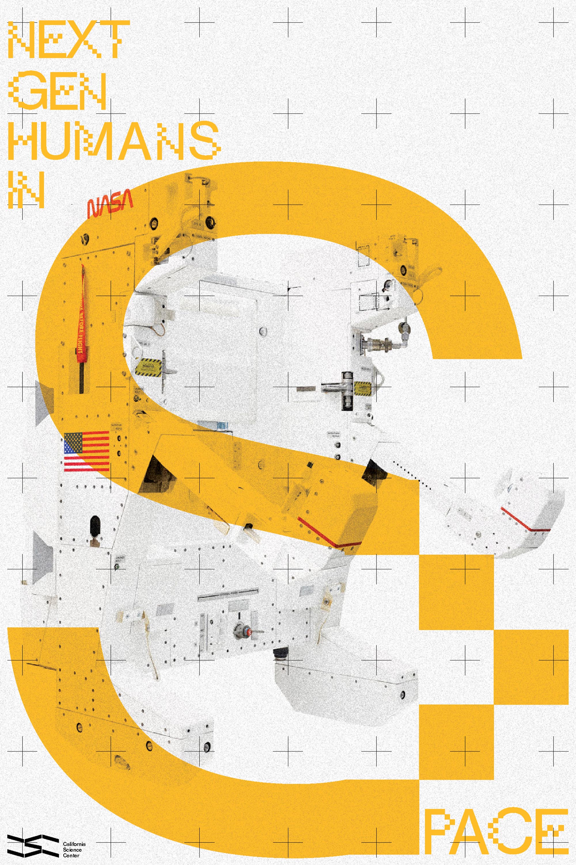
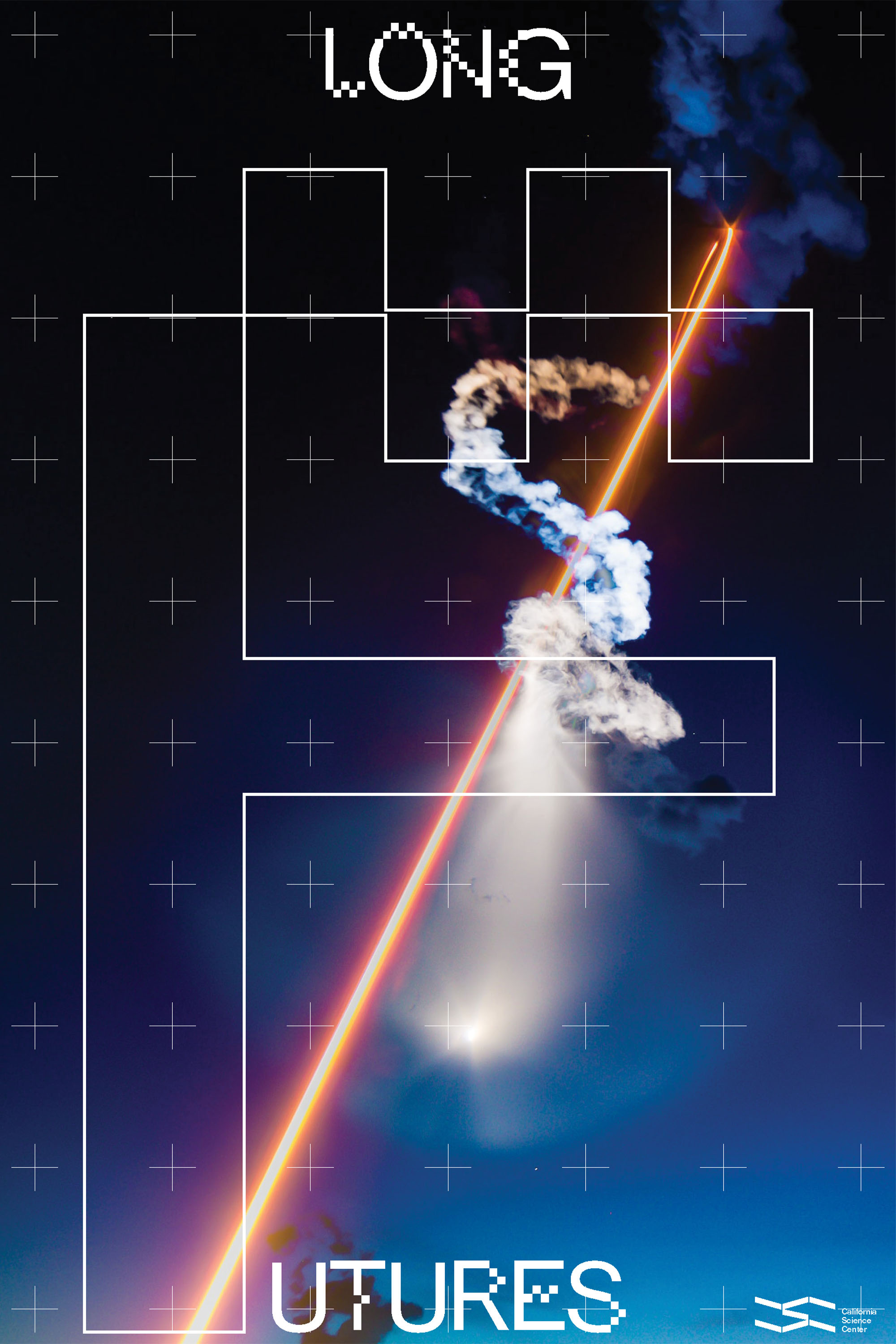

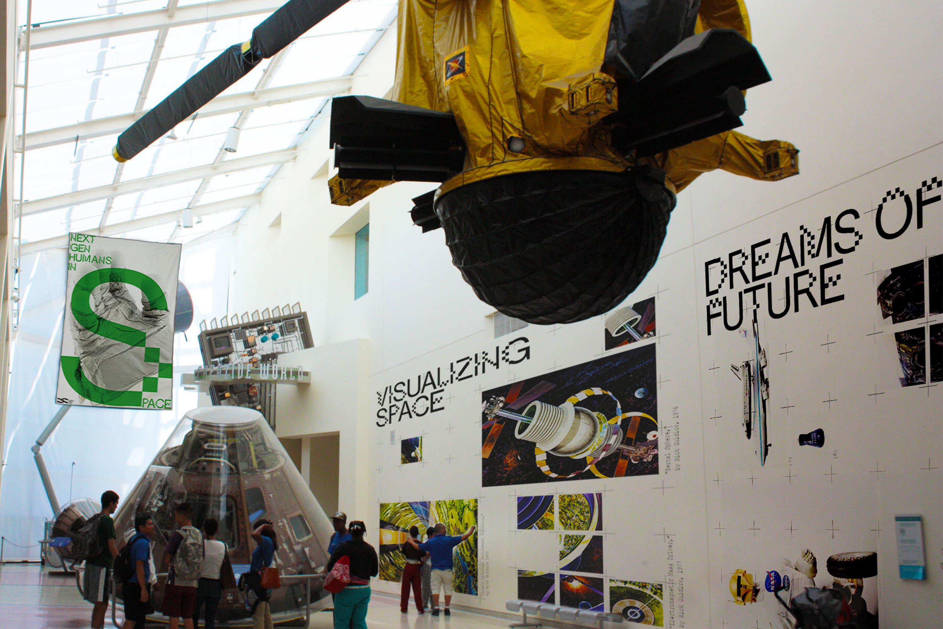
Environmental Signage : To create the most visual impact, the custom typeface demands a lot of space and attention. It immediately attracts the viewer with scale and imagery to start to question what the next generation of humans would be.
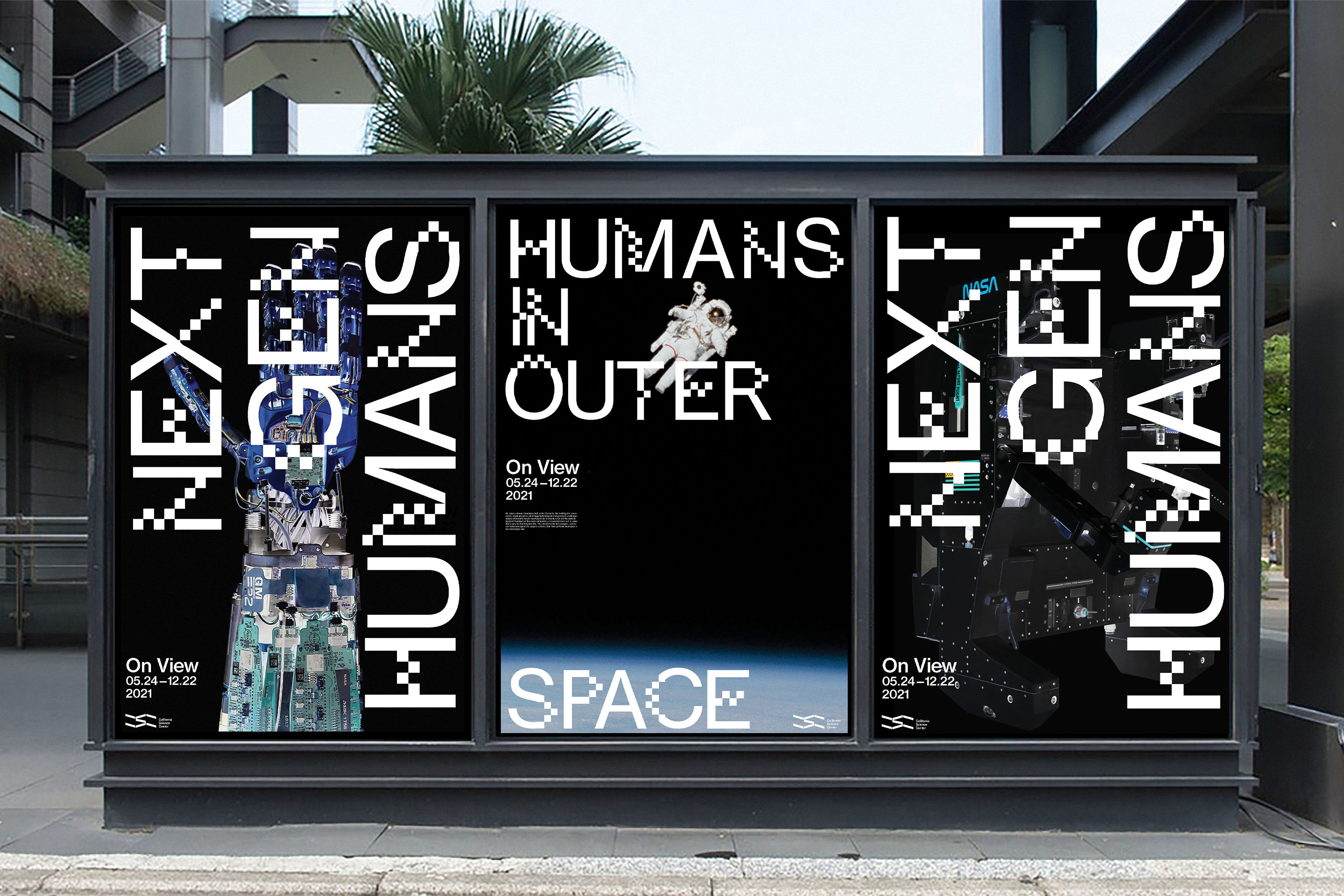


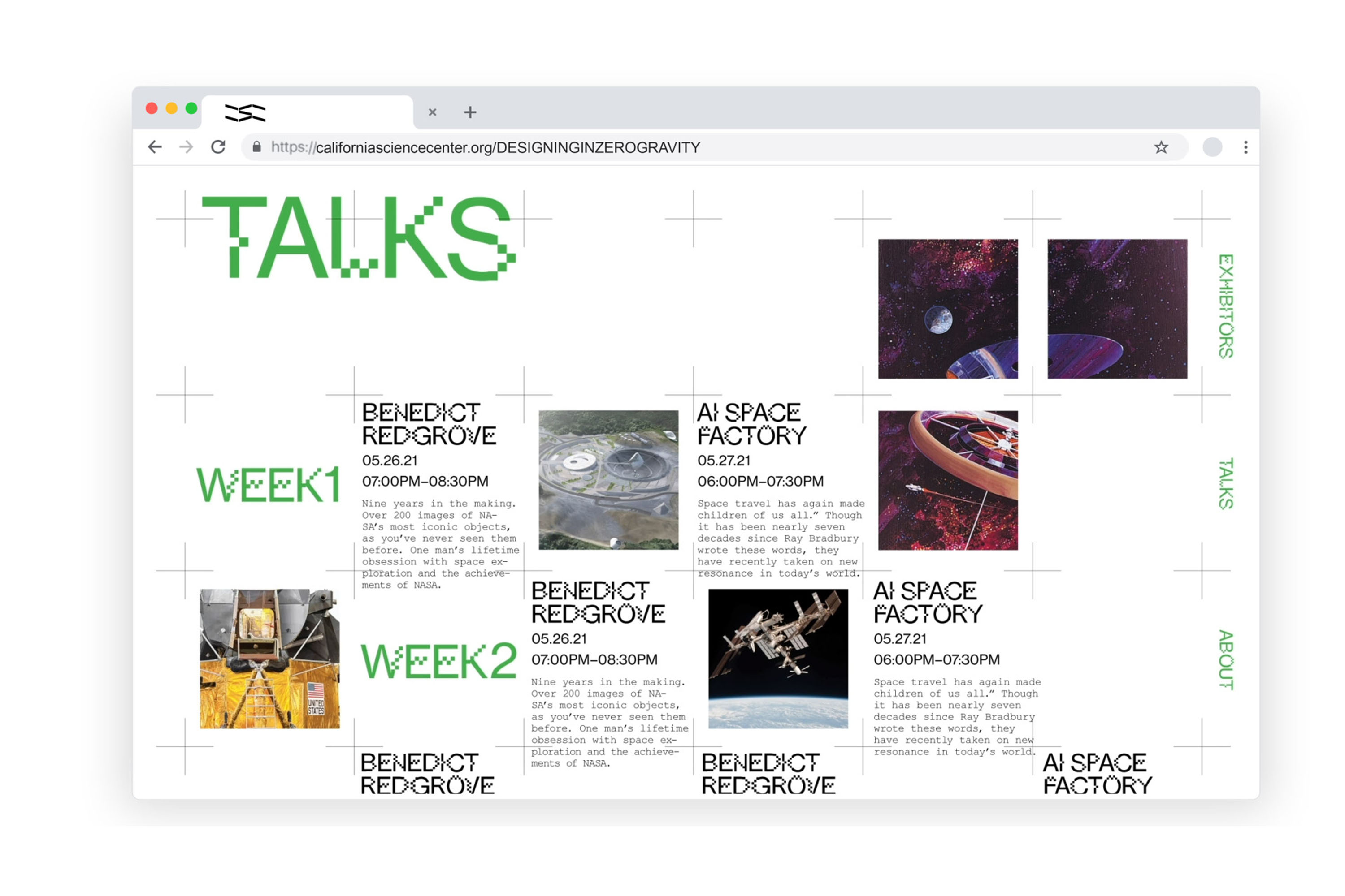
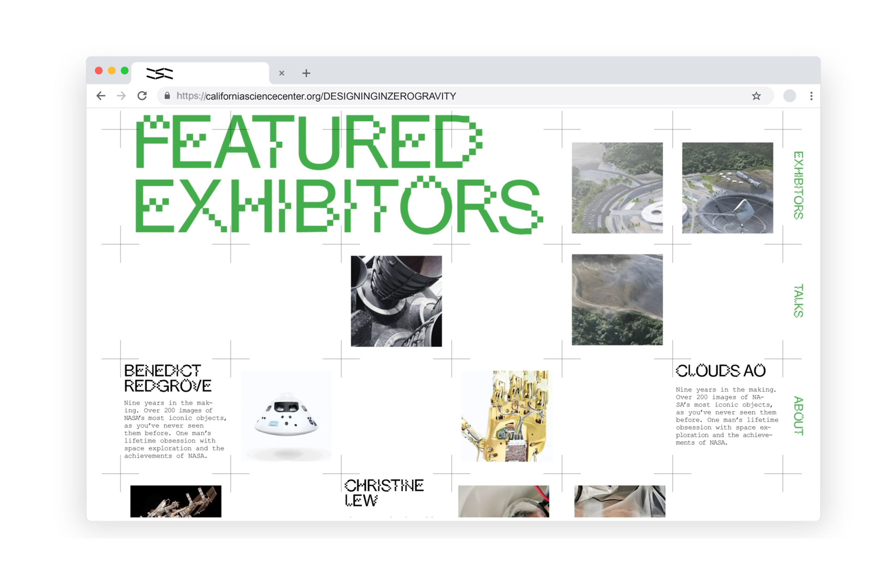
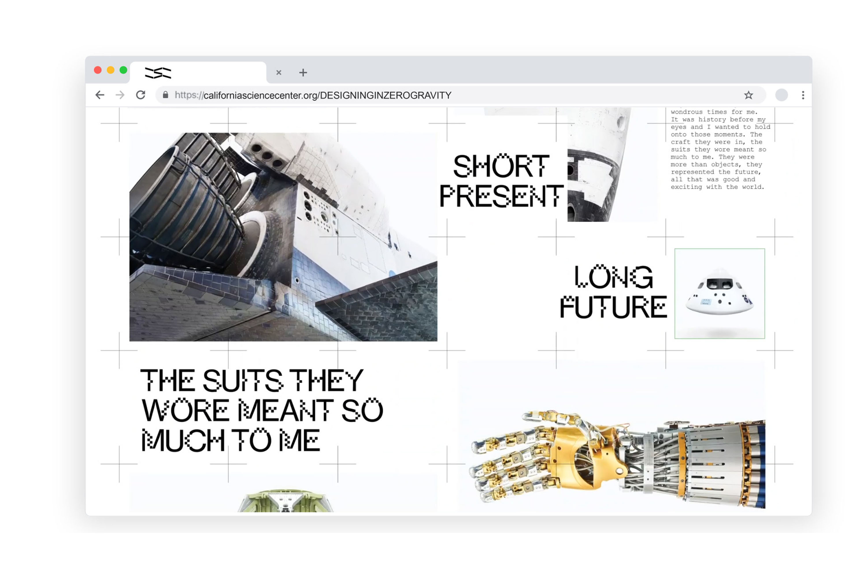
Website: The web stays true to the visual language of the exhibition. The crosshairs reference space photography but are used as the grid system that is referenced by the custom typography.fdg
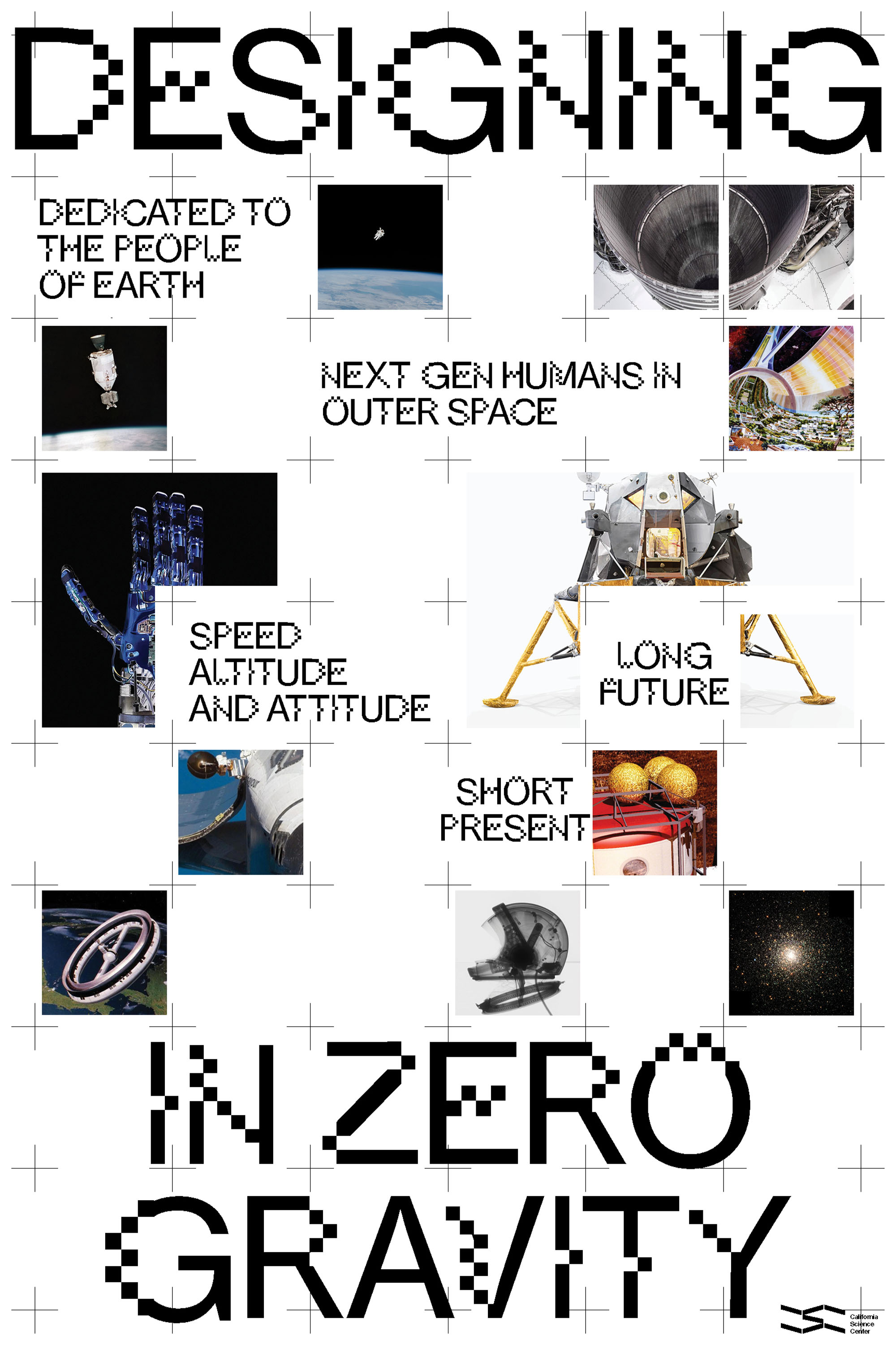
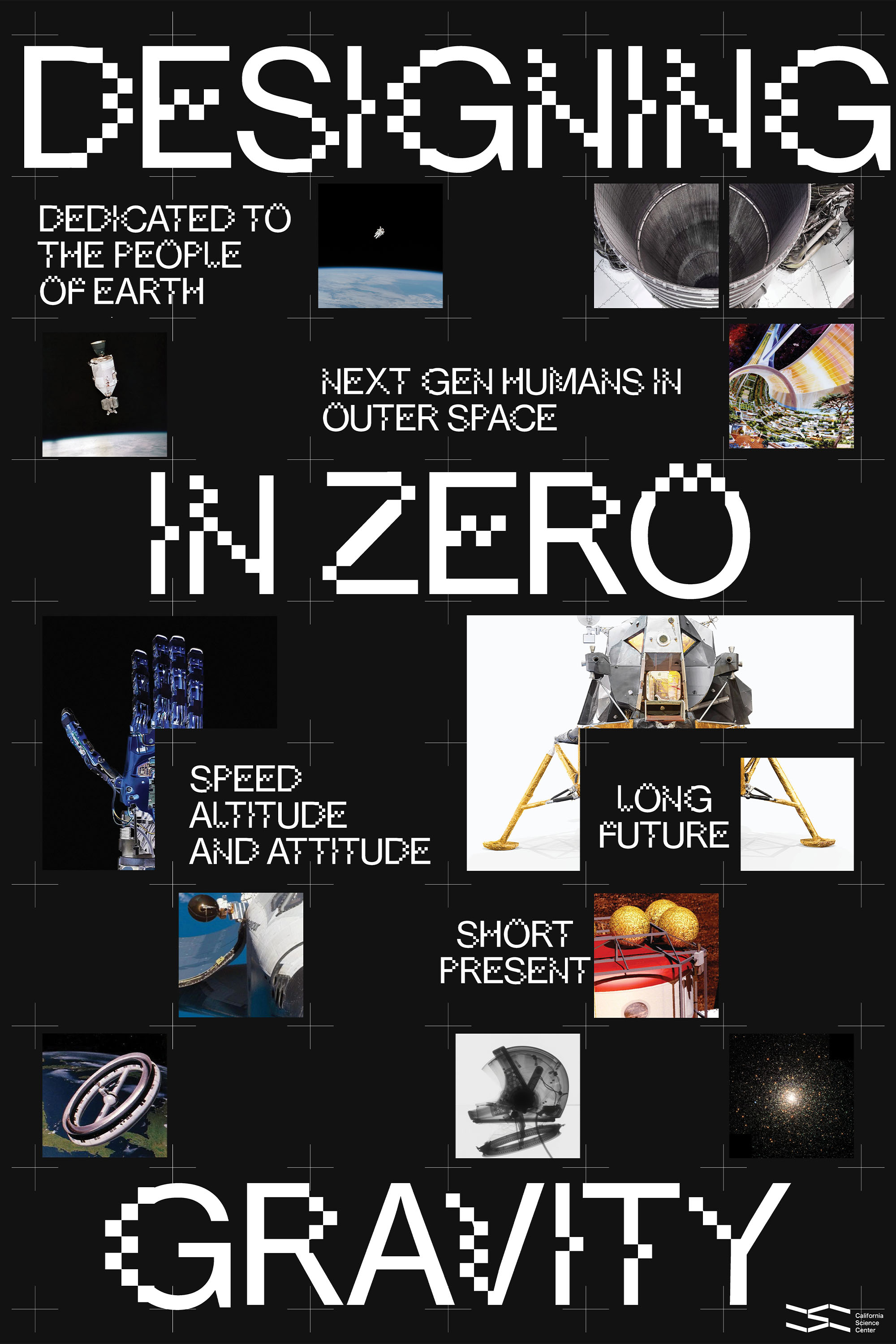
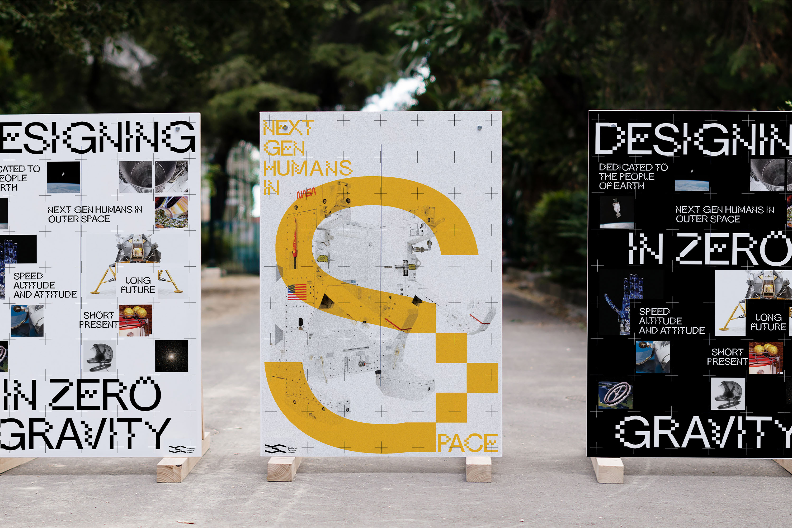
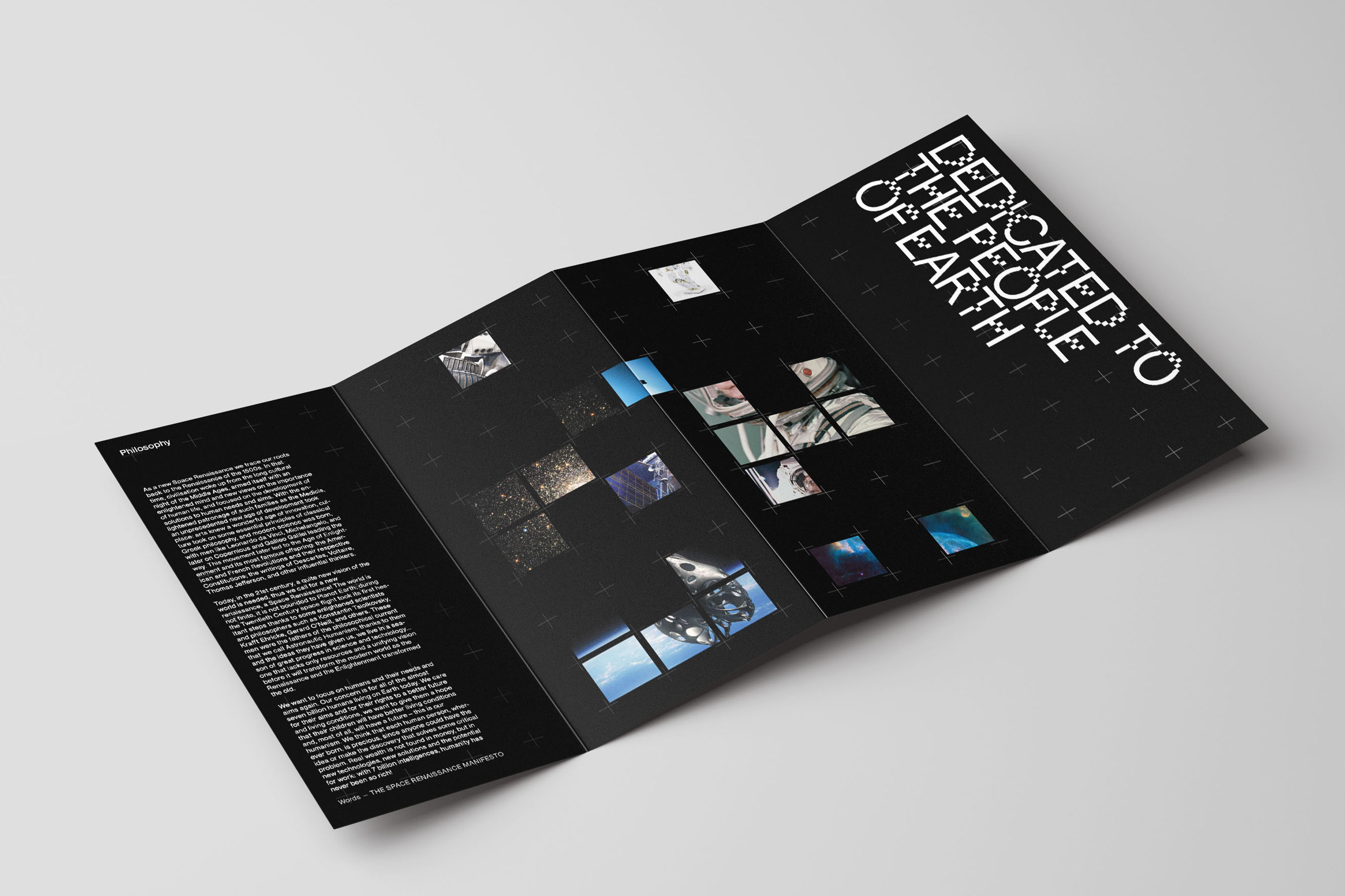
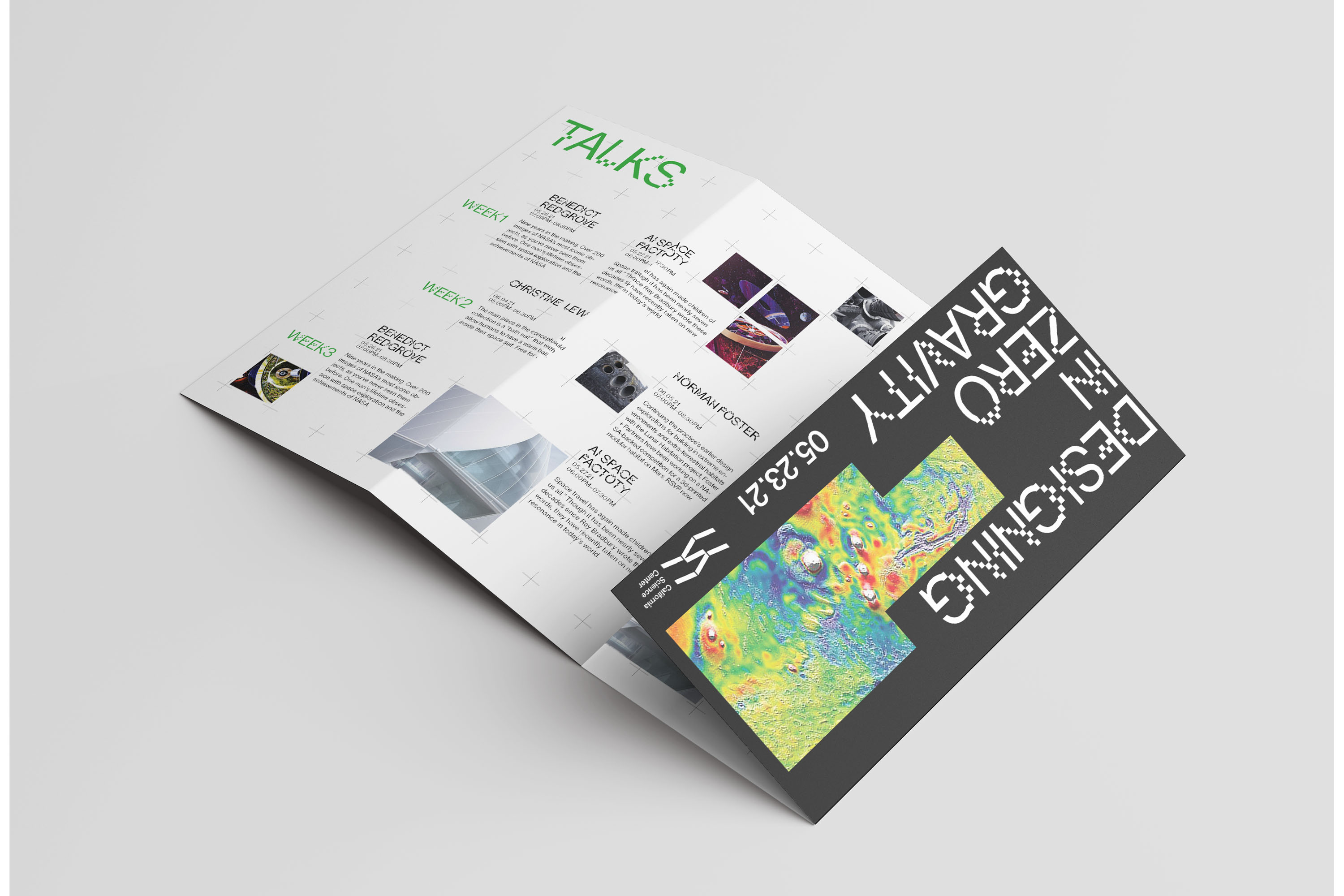
Exhibiton Catalog: The exhibition catalog functions as a 4-up fold where there is an element of discovery as you travel through the pages. The catalog plays with the idea of hiding and revealing. It creates an element of surprise that is very much the experience of what the exhibition would showcase.


Exhibition Signage: The crosshair from space photography was a big inspiration when it came to the design of the entire system. It was used as a grid to organize and break up information, while still leaving room for experimentation and unique characters within the spacial graphics.


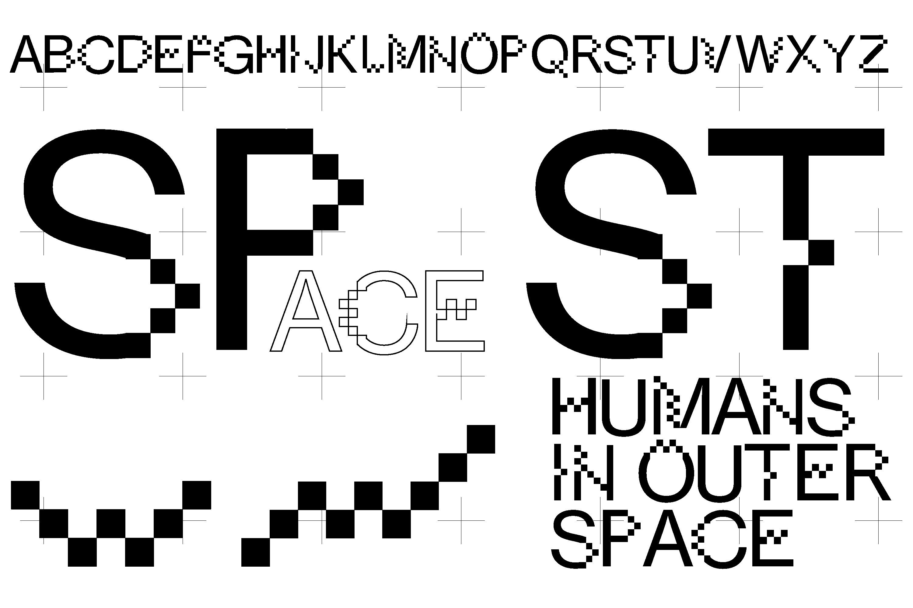
Custom Typeface: The idea to create a modular typeface is to bring forward two opposite ideas, the familiar (Earth ) vs the unfamiliar (Space). Using Neue Haas Grotesk as a starting point, the typeface is broken up into modular pieces to blend the two ideas, the unfamiliar with the familiar.