
*** California Science Center ***
Category: Identity System
Year: 2020
Mentors: Brad Bartlett, Roy Taytum, Chris Taylor, Sharon Park
The California Science Center stimulates curiosity and inspires science learning in everyone by creating fun memorable experiences. They value science as an indispensable tool for understanding our world and enriching people’s lives.
The natural rhythms found in nature that communicate interconnections, DNA structures, and natural sequences were a direct response to the thinking of the logo.
(This is a hypothetical student project done at ArtCenter College of Design.)
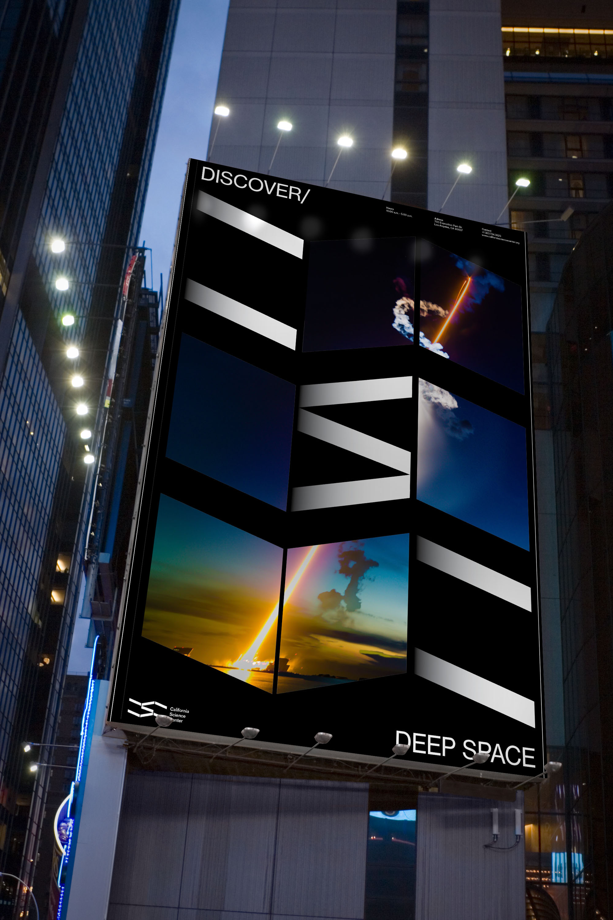
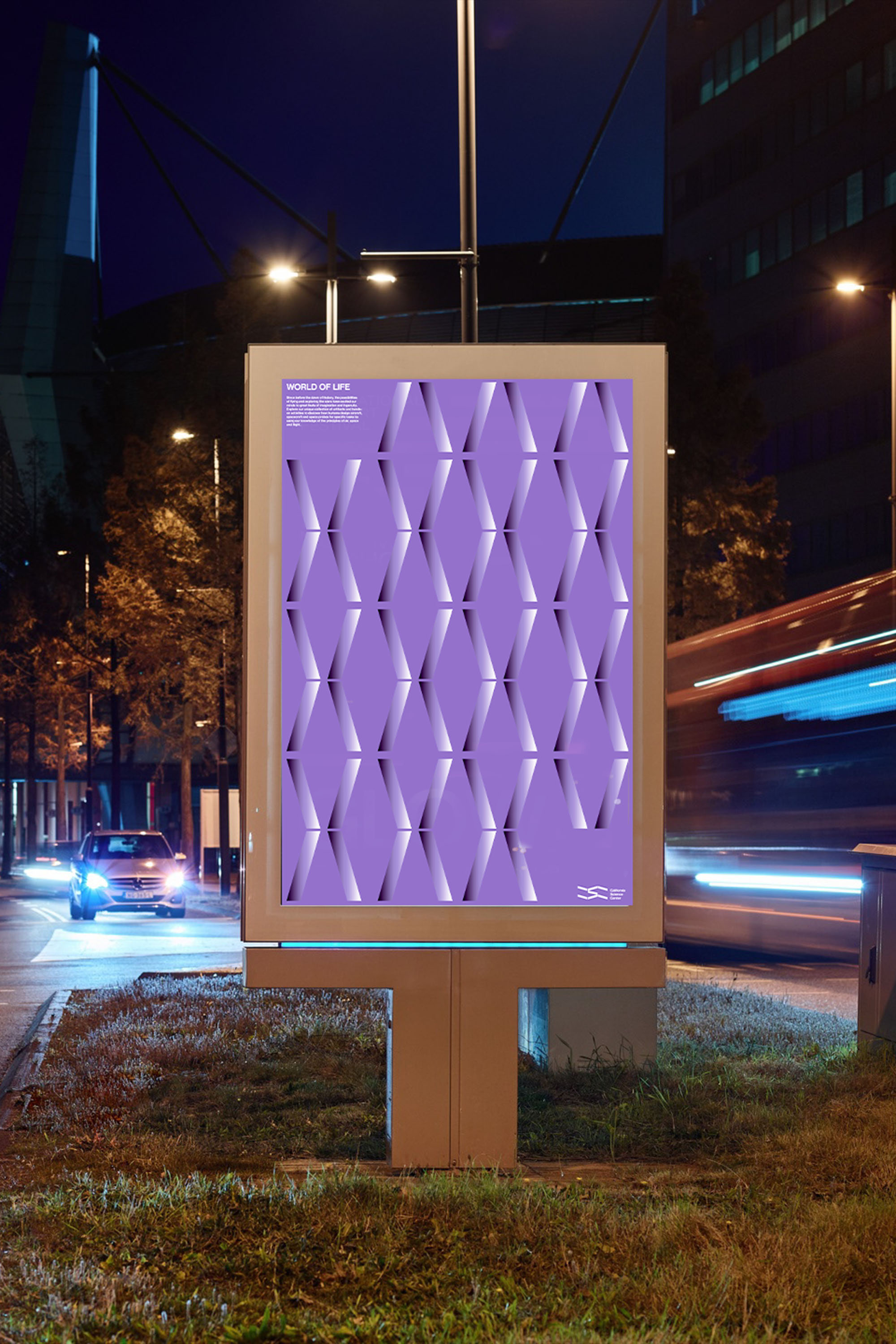
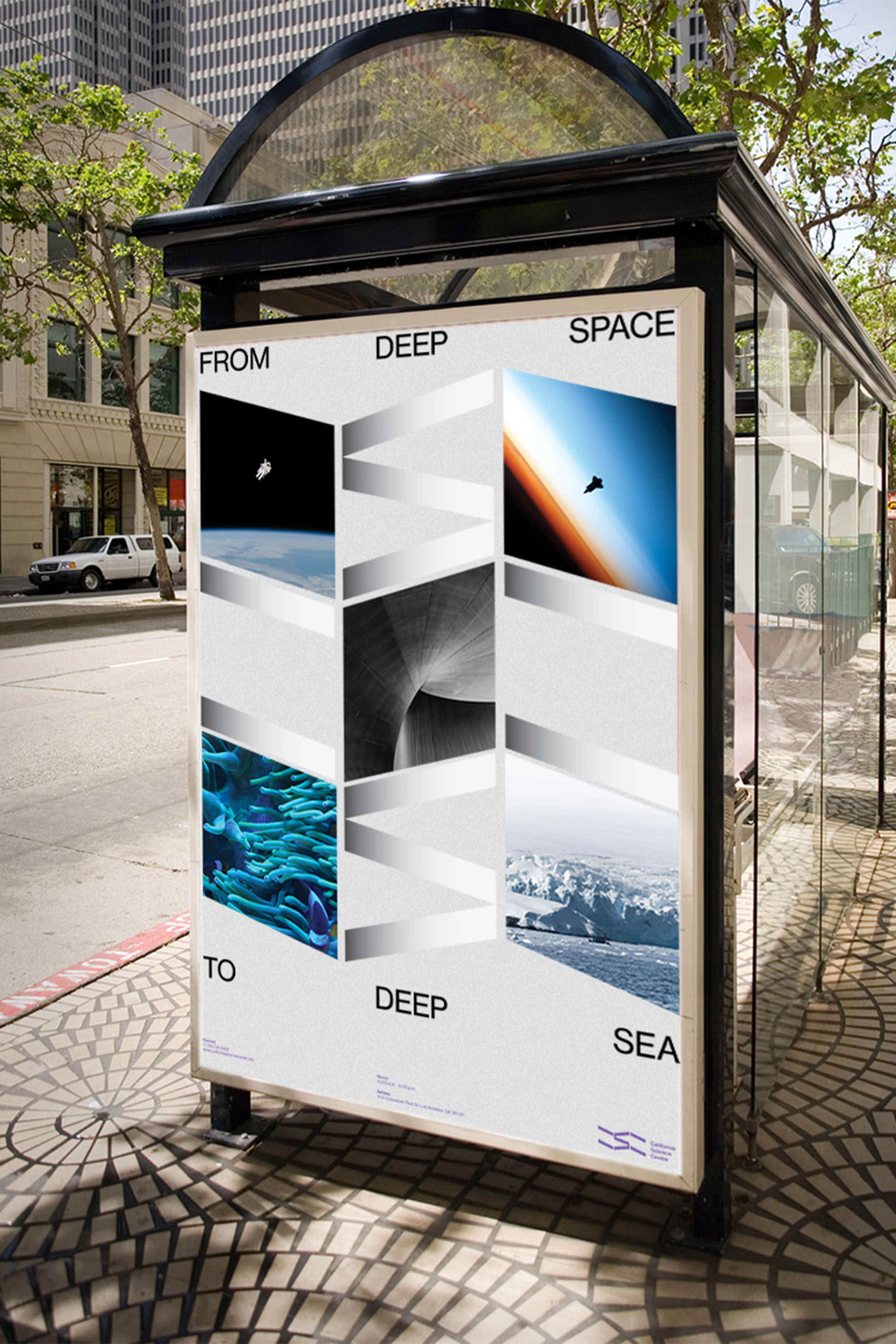
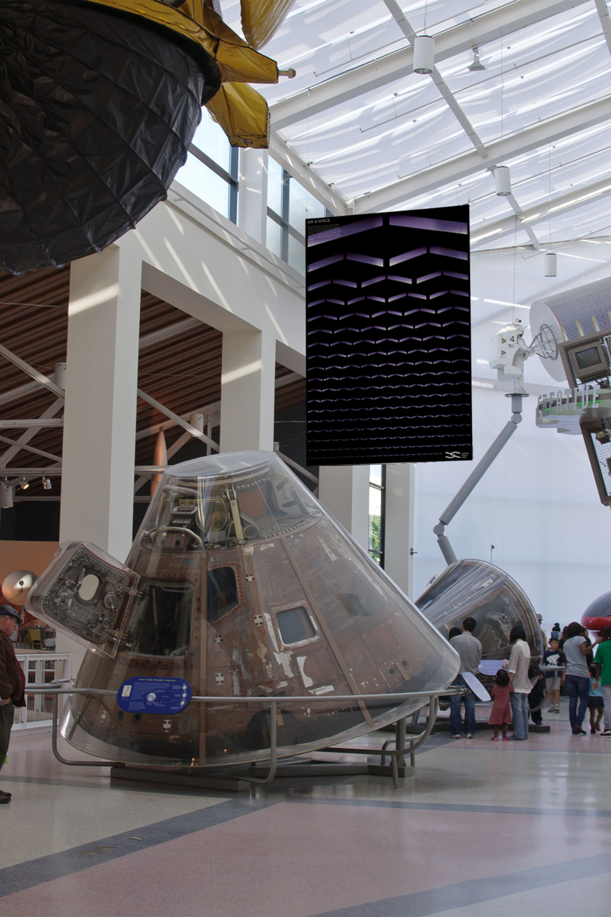
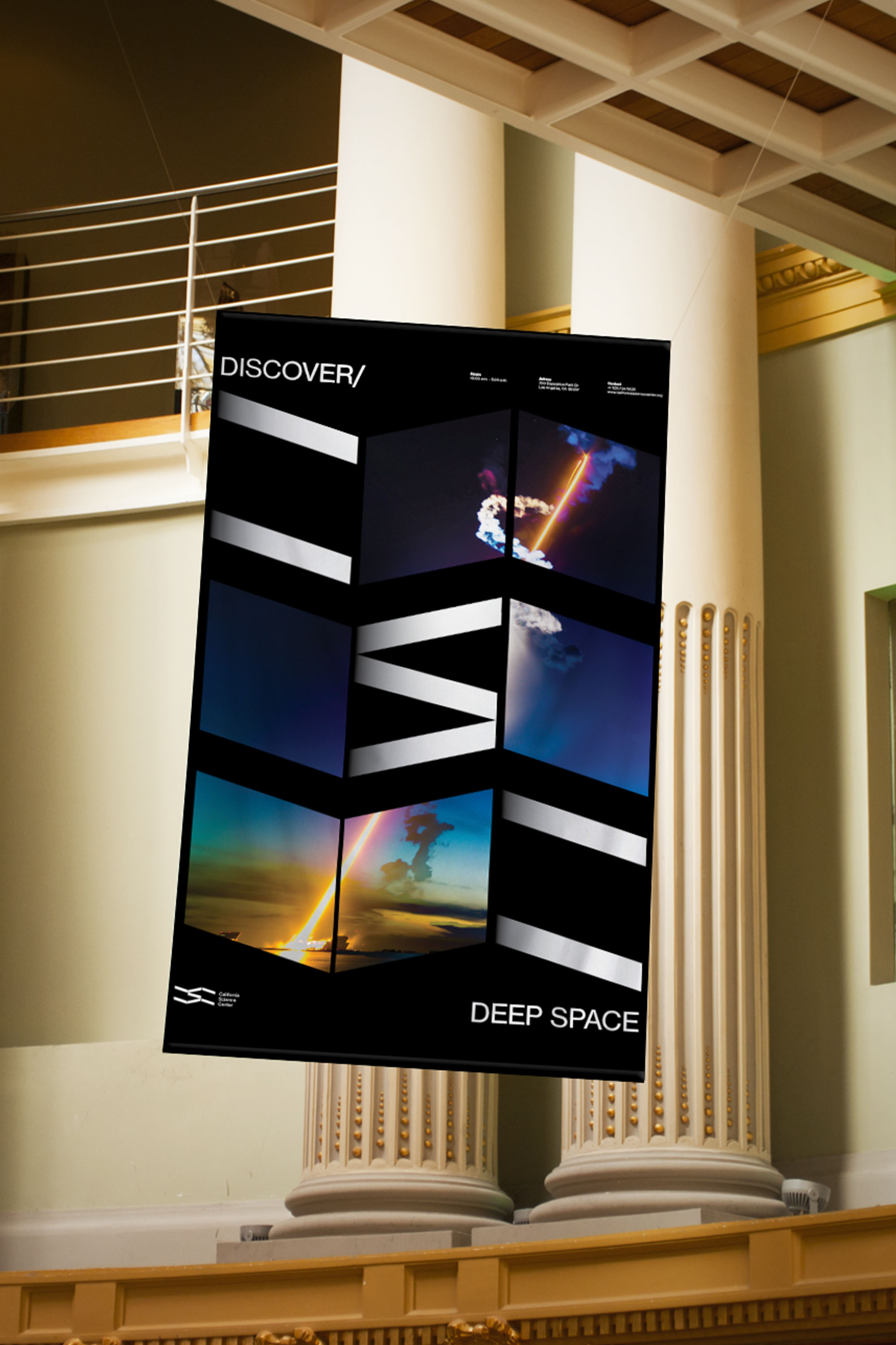
Poster Series: The poster series makes full use of the mark and the relationship that was found within the form. There are three ways of approach. One where the mark is used as a portal into the subject matter, the second is more information-driven, and the third uses the language of the logo to give the permanent exhibitions (Air & Space, Ecosystems, & World of life) their identity.

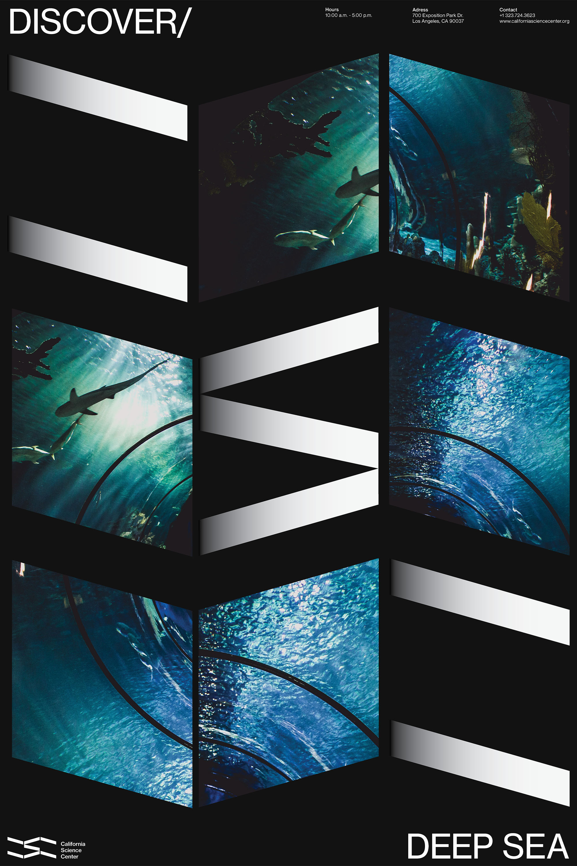
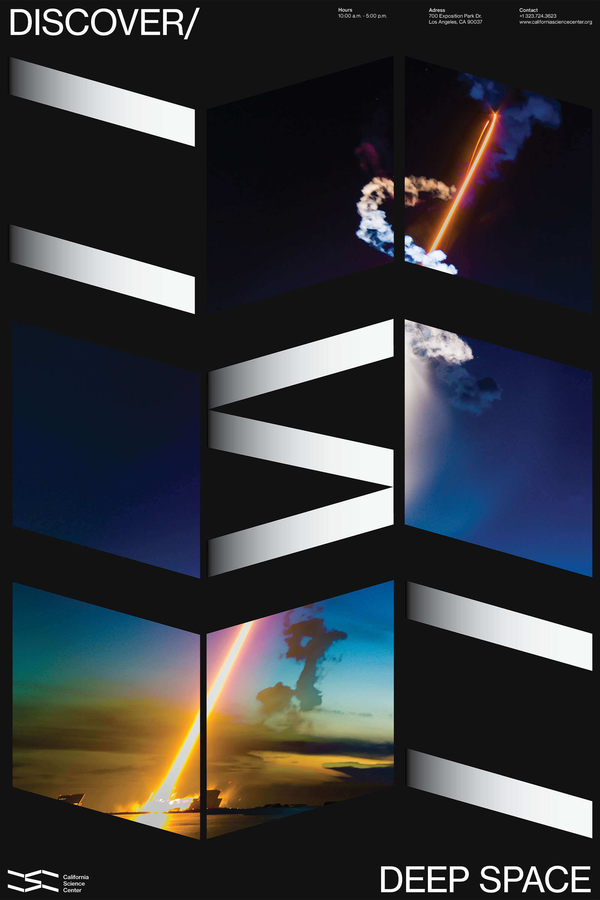
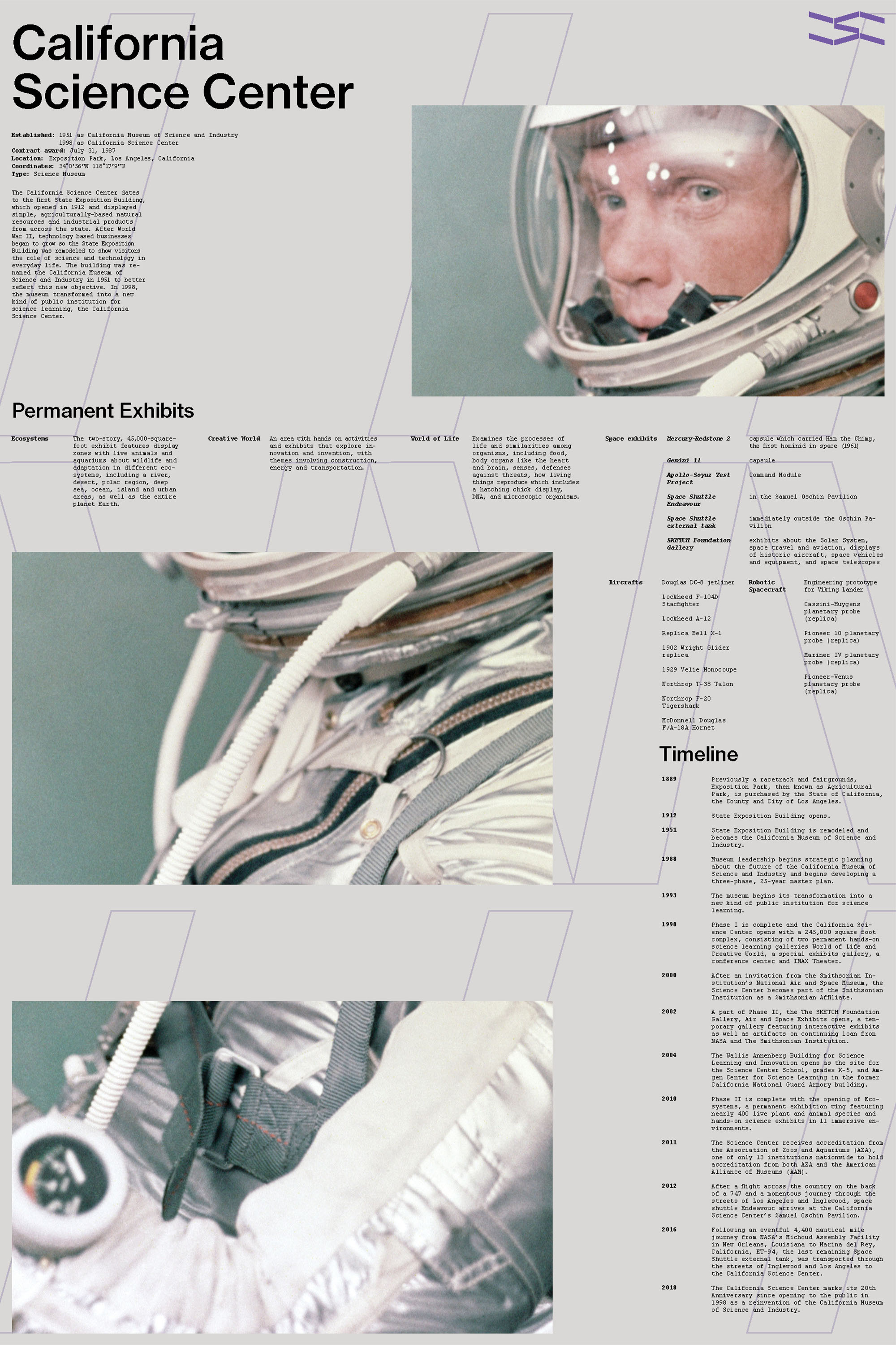
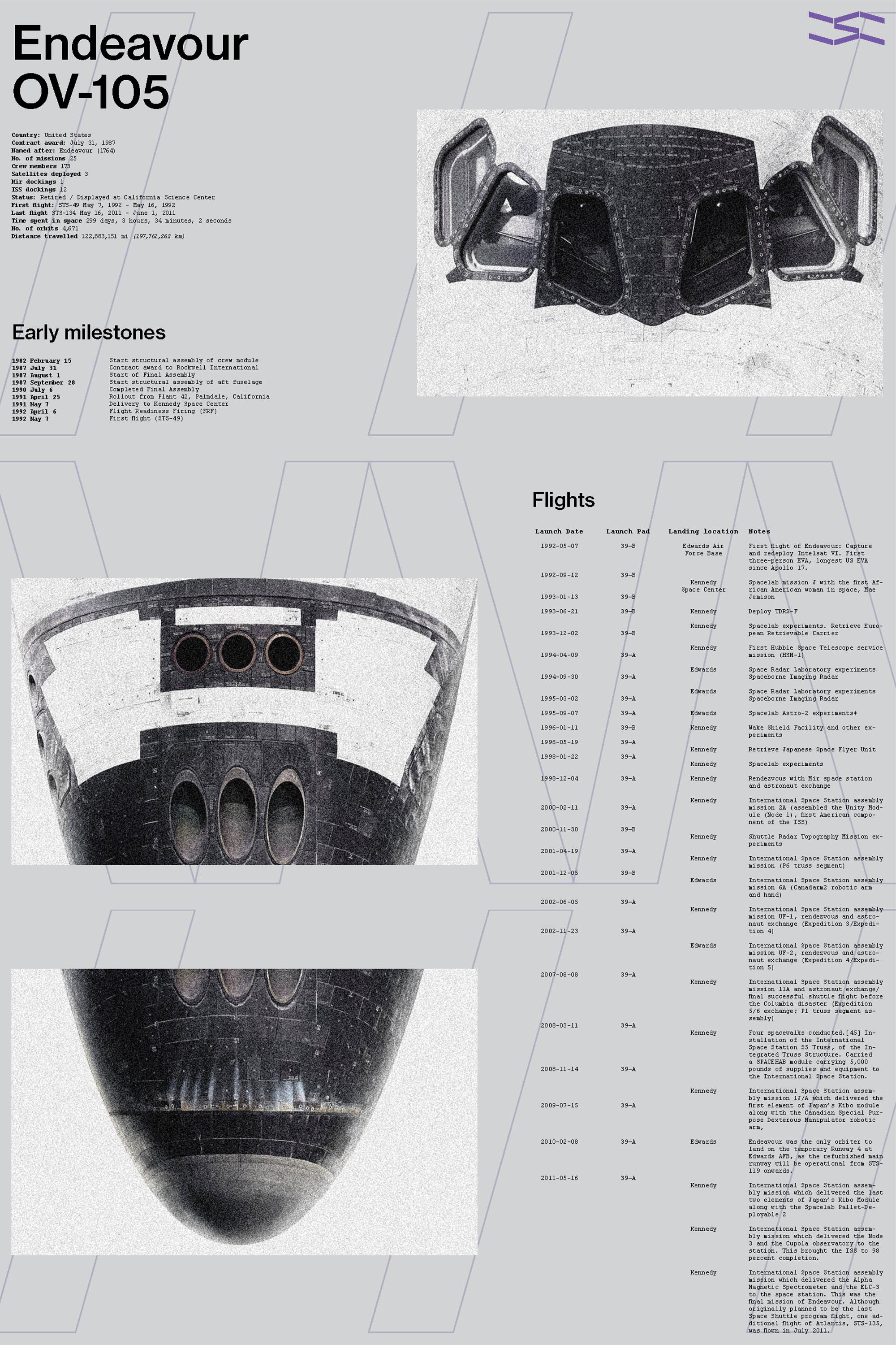



Spacial Graphics: The CSC primarily focuses on science learning for younger children. The use of this new visual language takes an approach to give the visual system a form of sophistication that the new older target audience would equally be as engaged with.
Website / Mobile : The website leverages the use of the beautiful imagery of the museum, to showcase the vibrant colors and engage the viewers while staying true to the brand system.


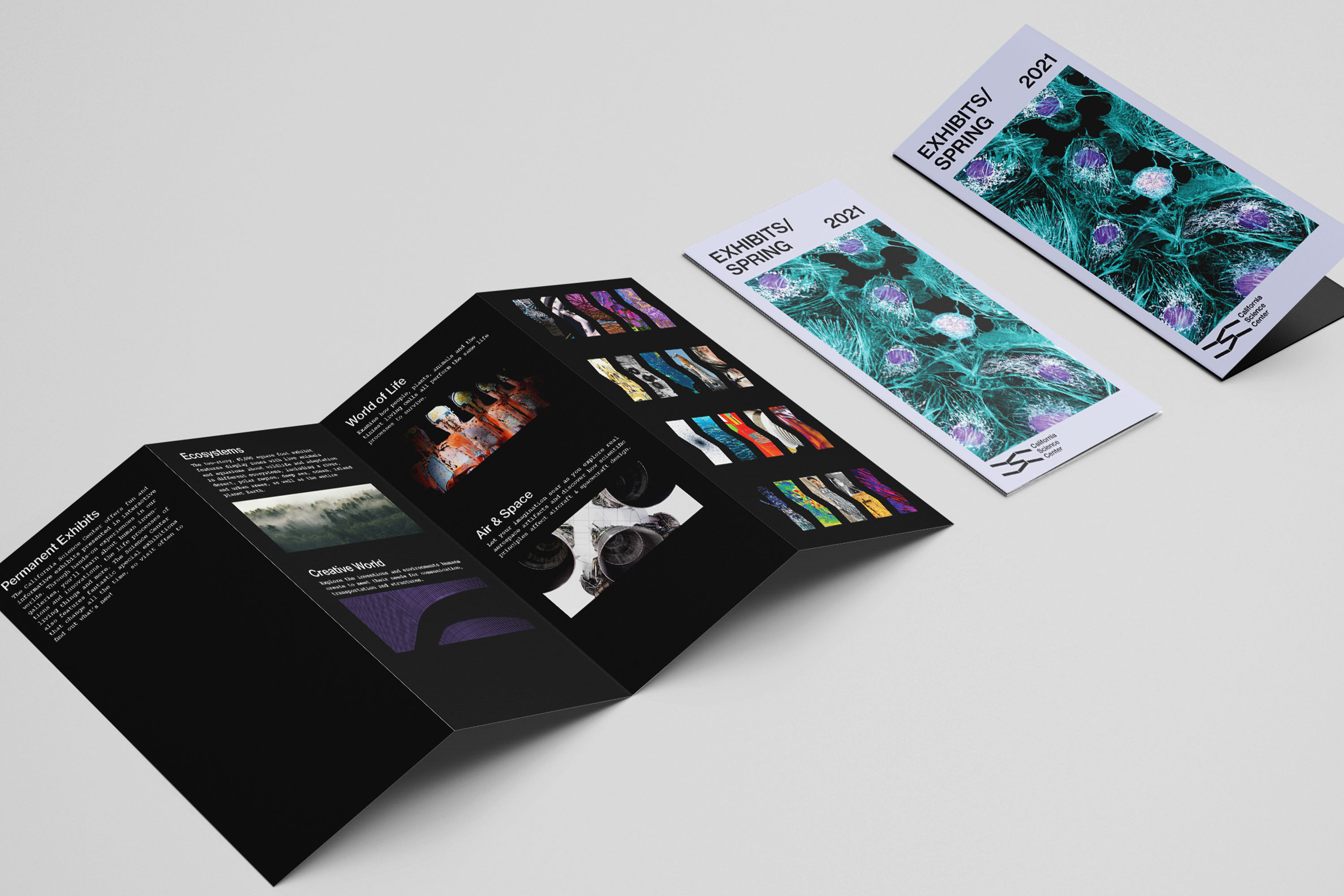
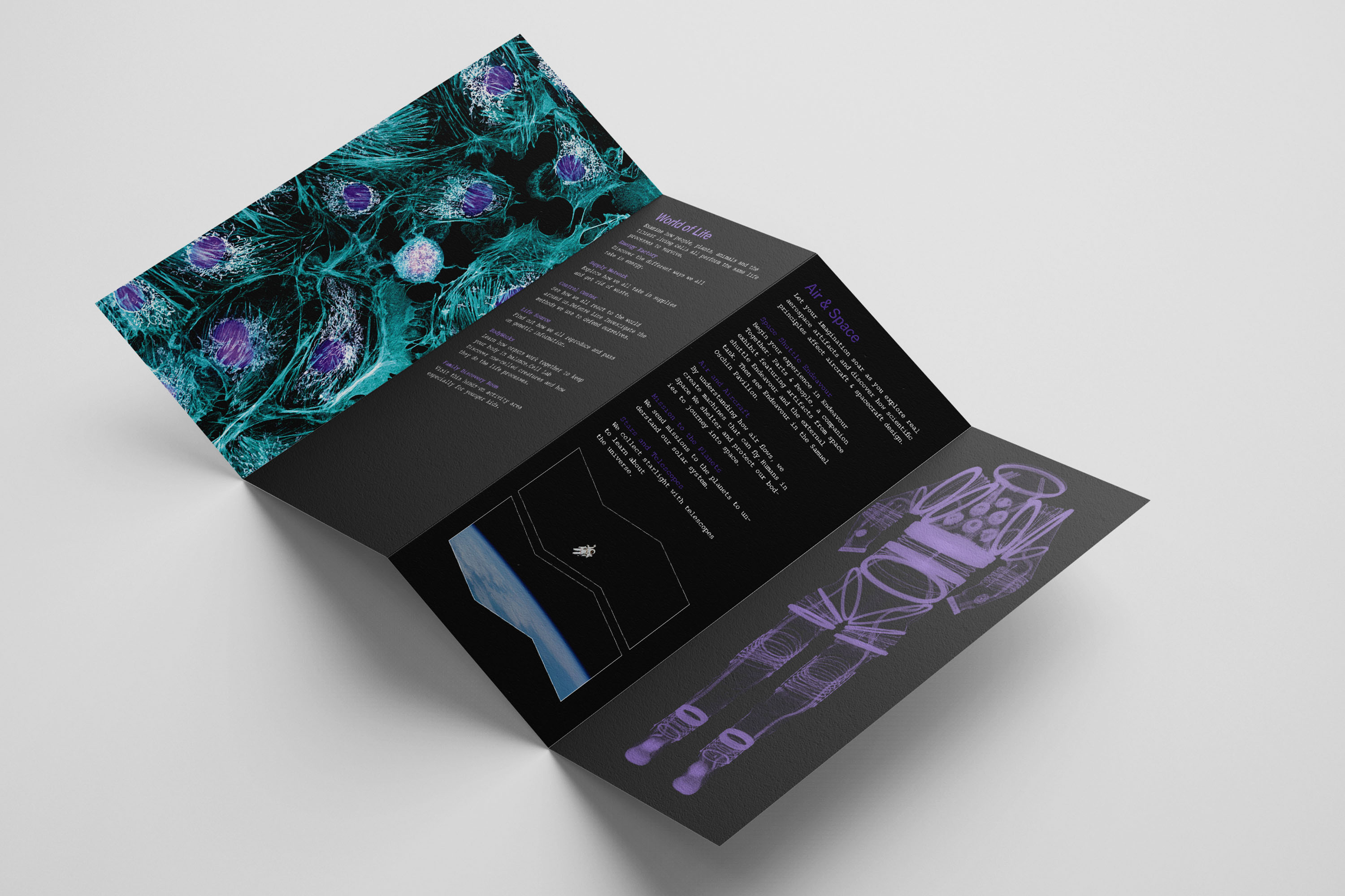
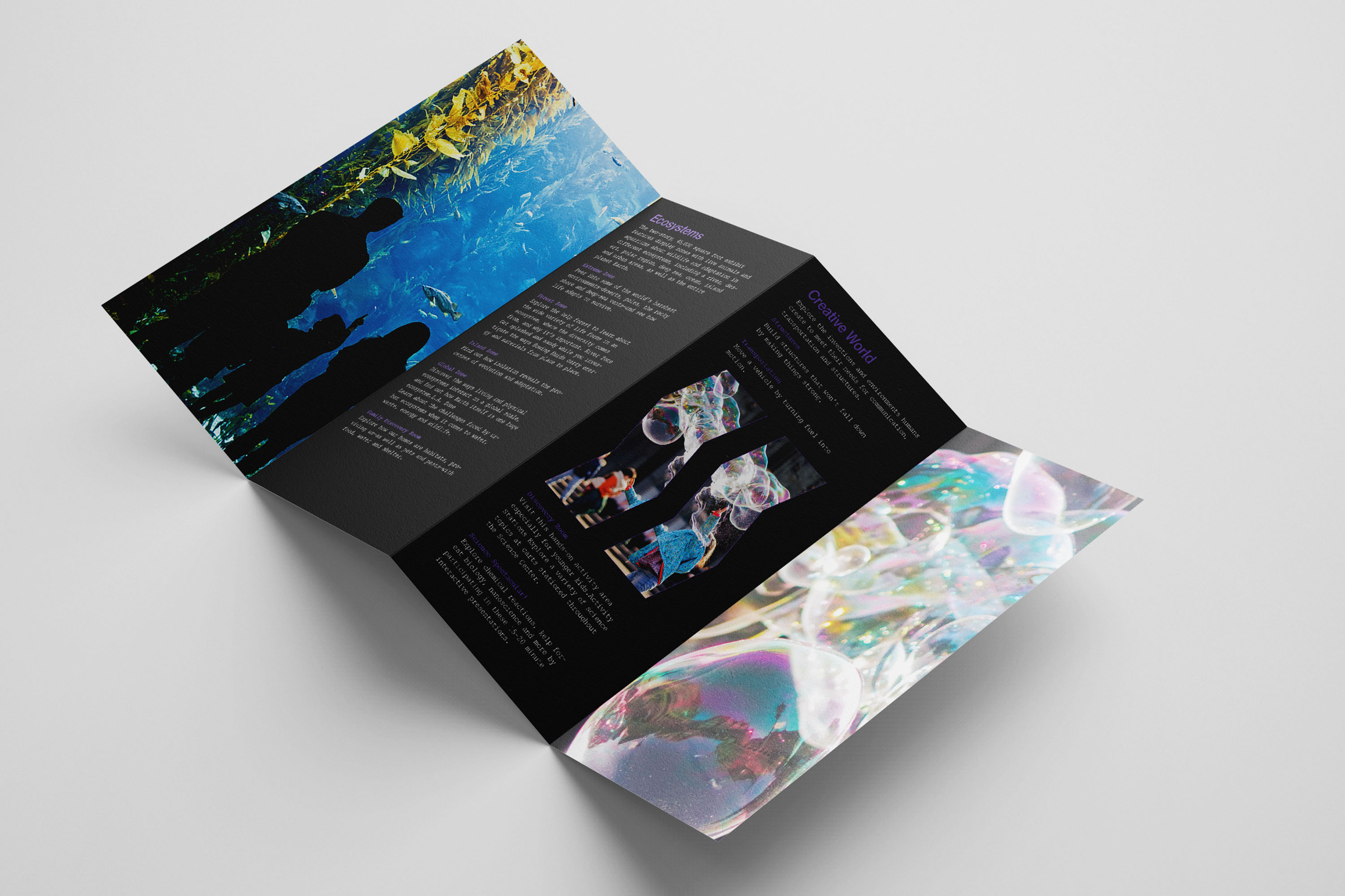
Quarterly Exhibition Catalog: The CSC has its core attractions, Air & Space, Creative World, Ecosystems, and World of life. Depending on the season, they have a rotating space for unique special exhibitions. The quarterly system gives info to newcomers who are not as familiar but stays up to date for those frequent visitors.

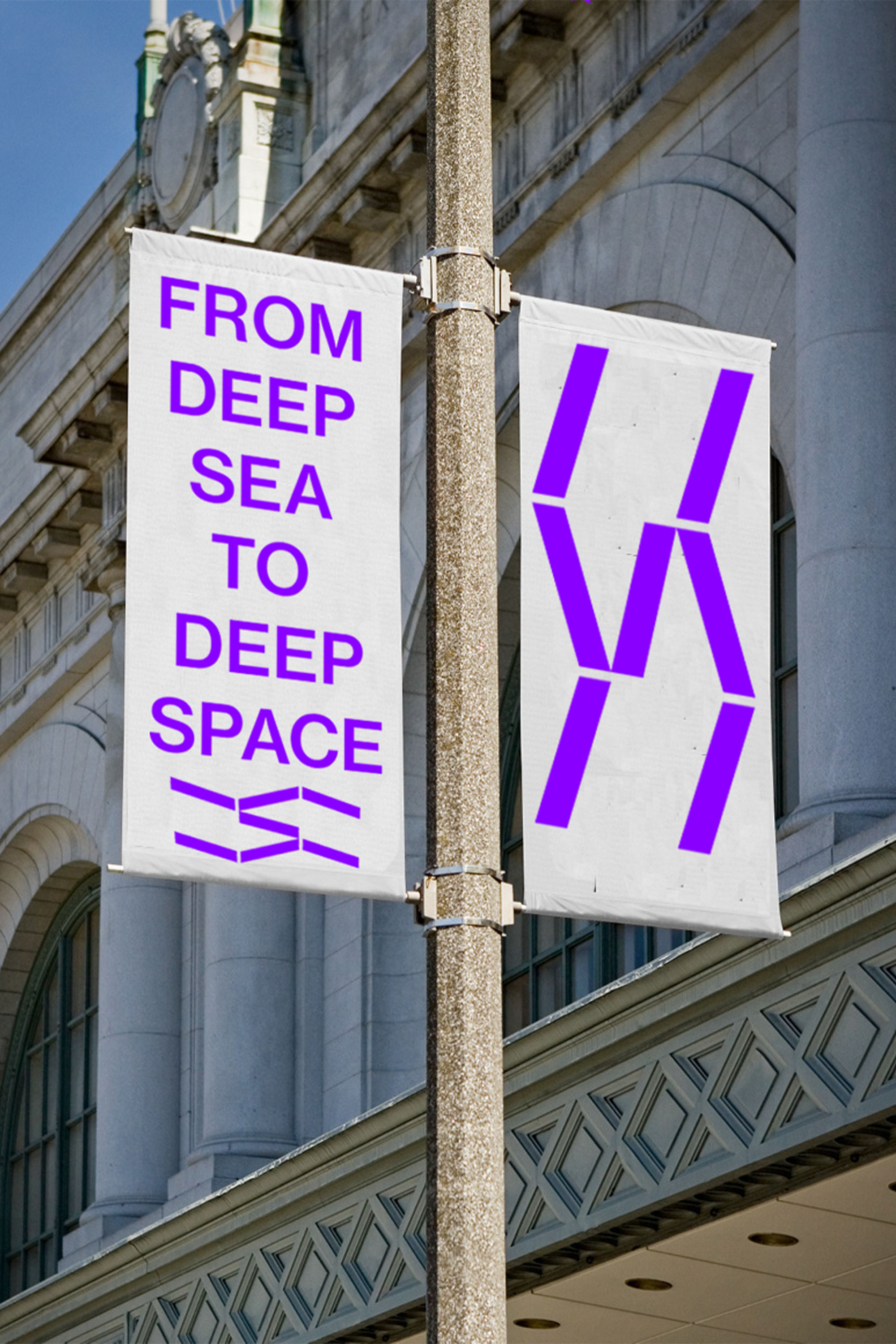
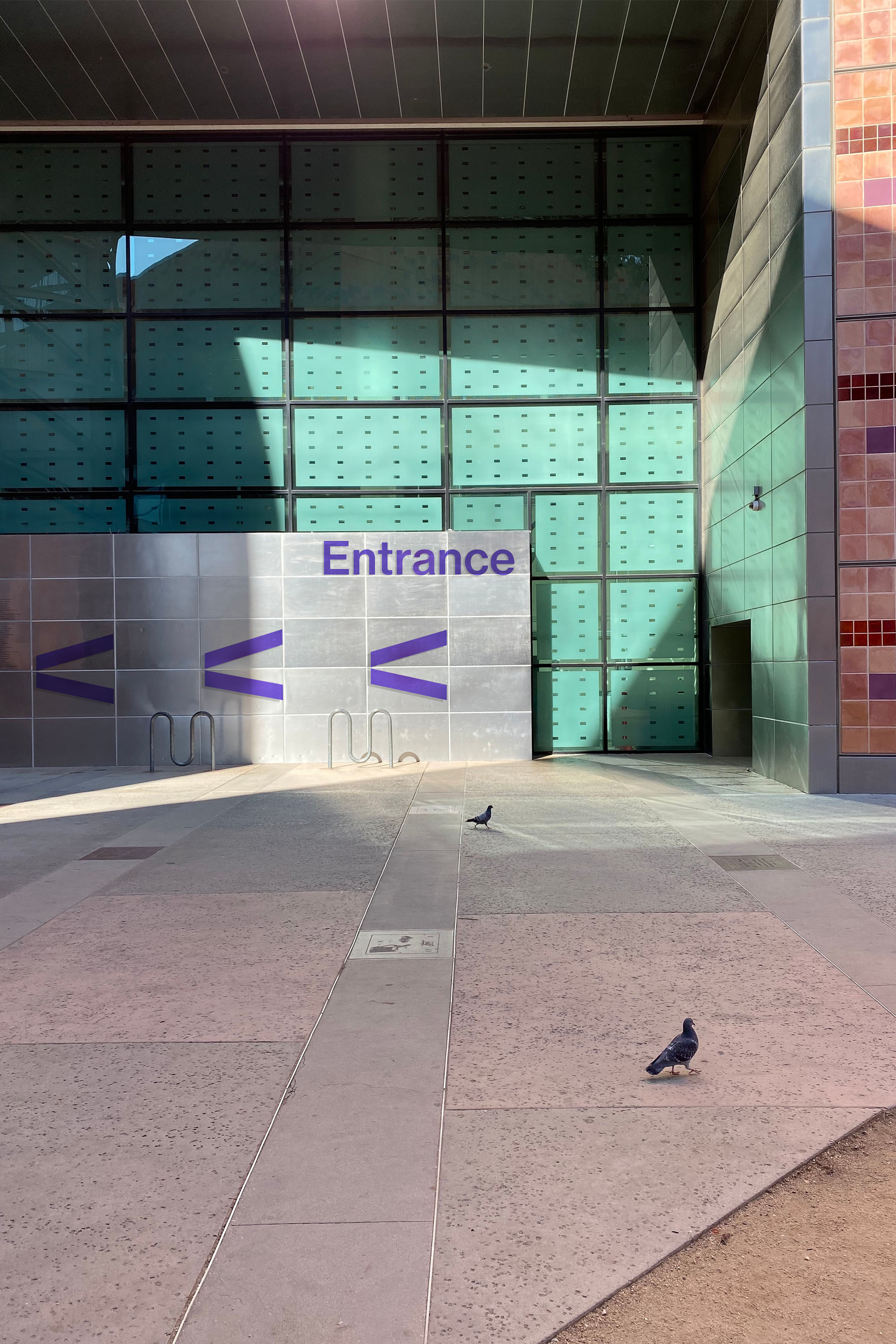
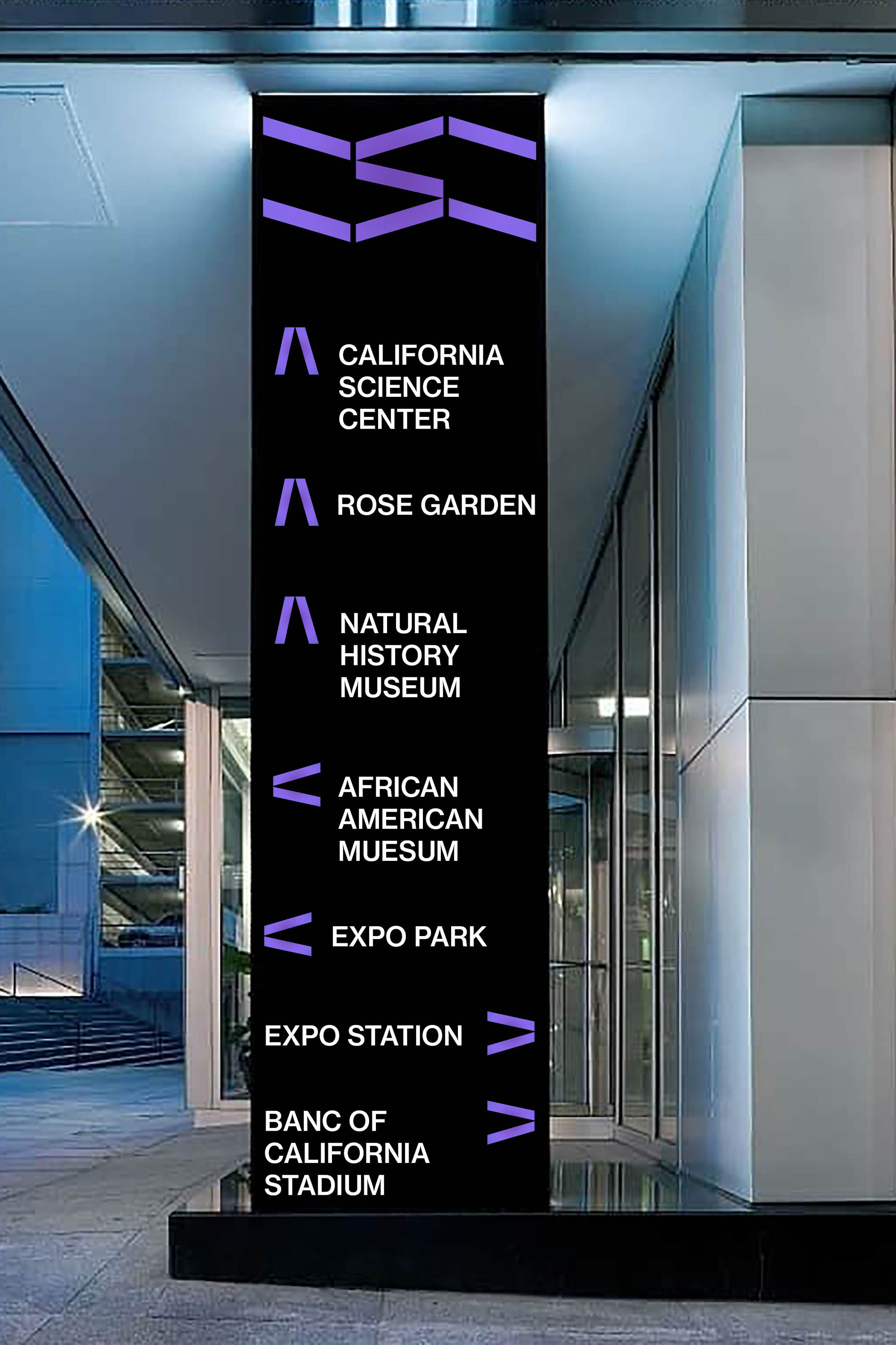
Enviornmental Signage : The CSC is located in the heart of Exposition Park in Los Angeles. The surrounding area is filled with world-class museums and park spaces. Therefore clear wayfinding and exterior signage was needed.


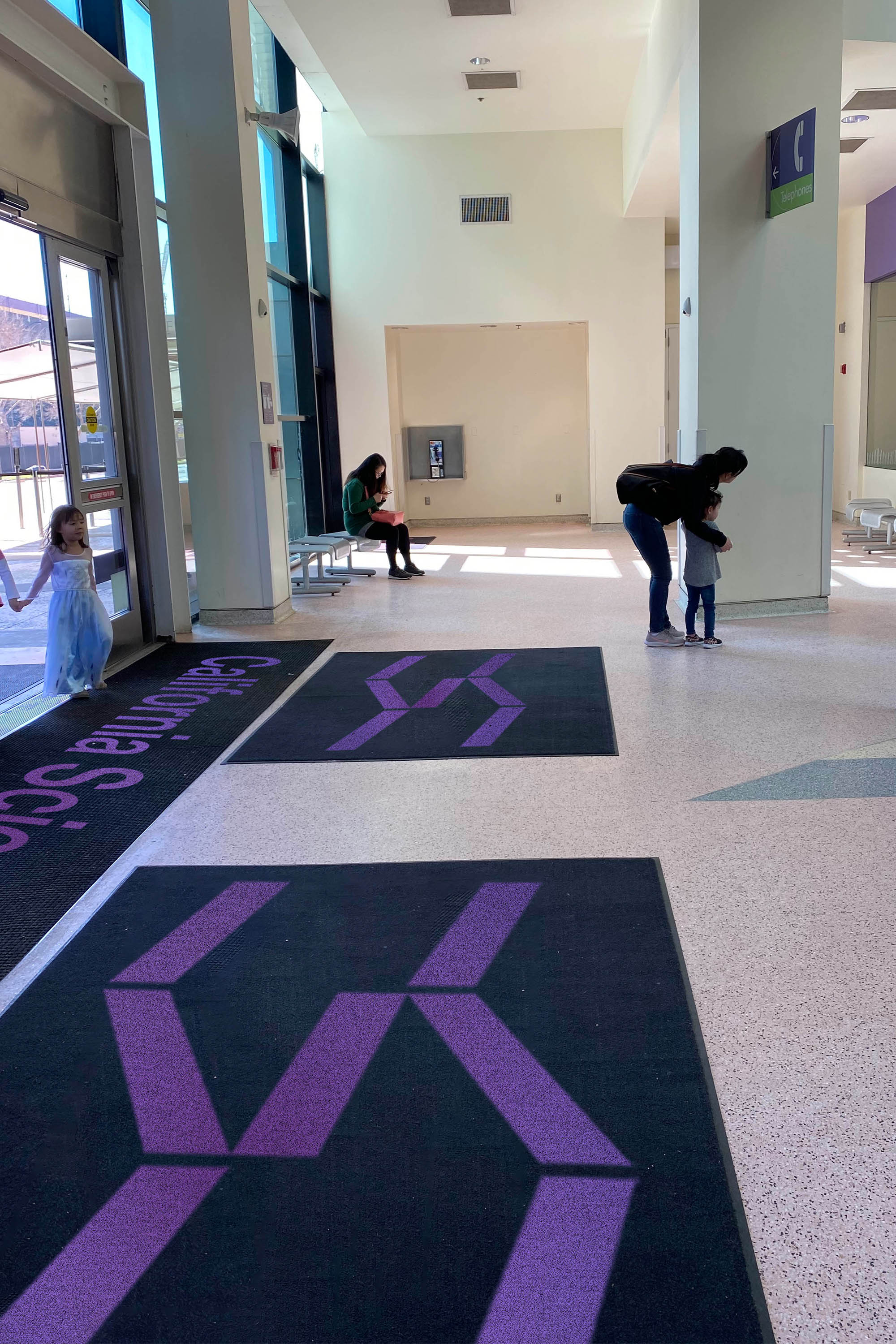

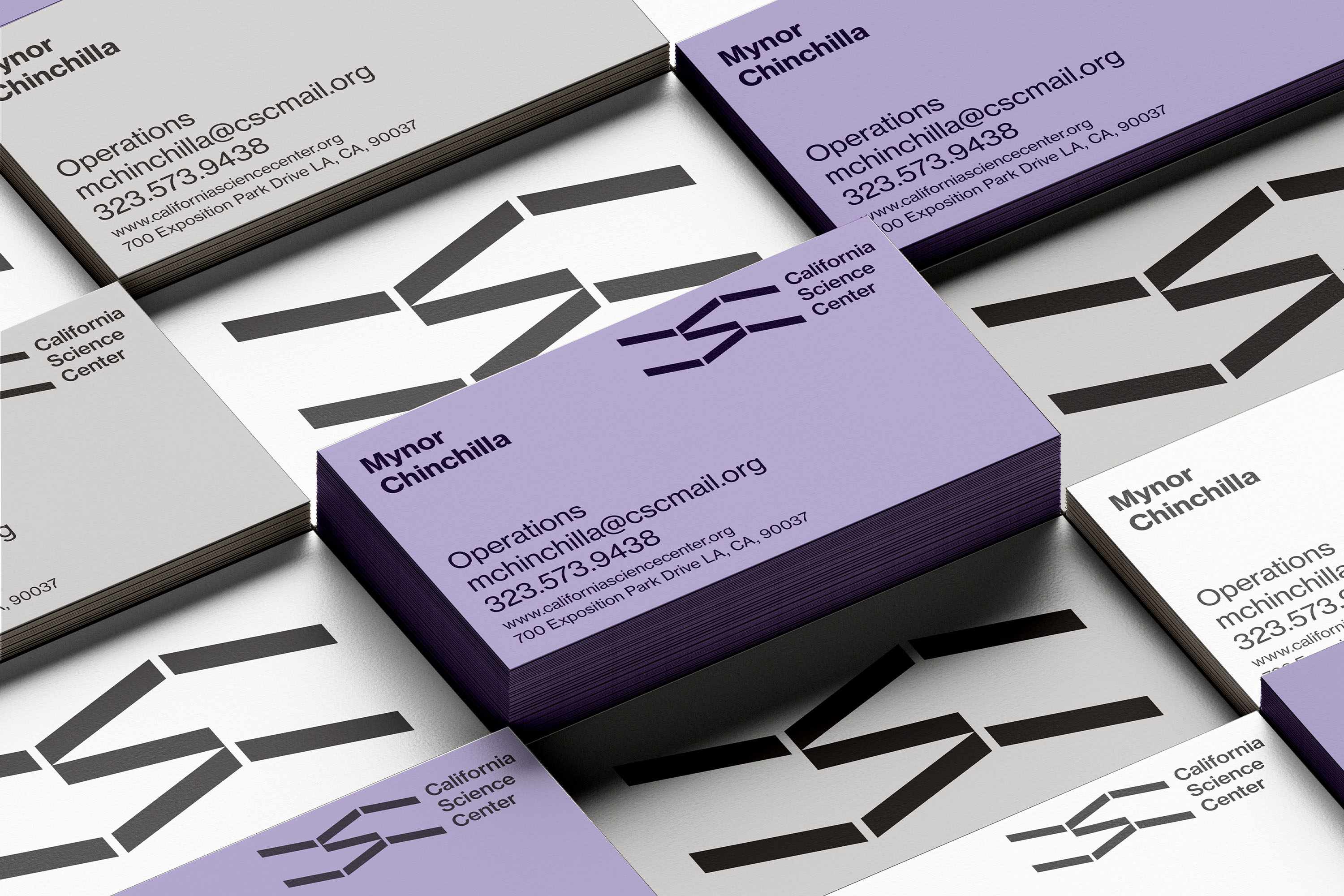
ID Collateral: The collateral makes use of the mark and finds ways to celebrate it while not getting overly decorative.

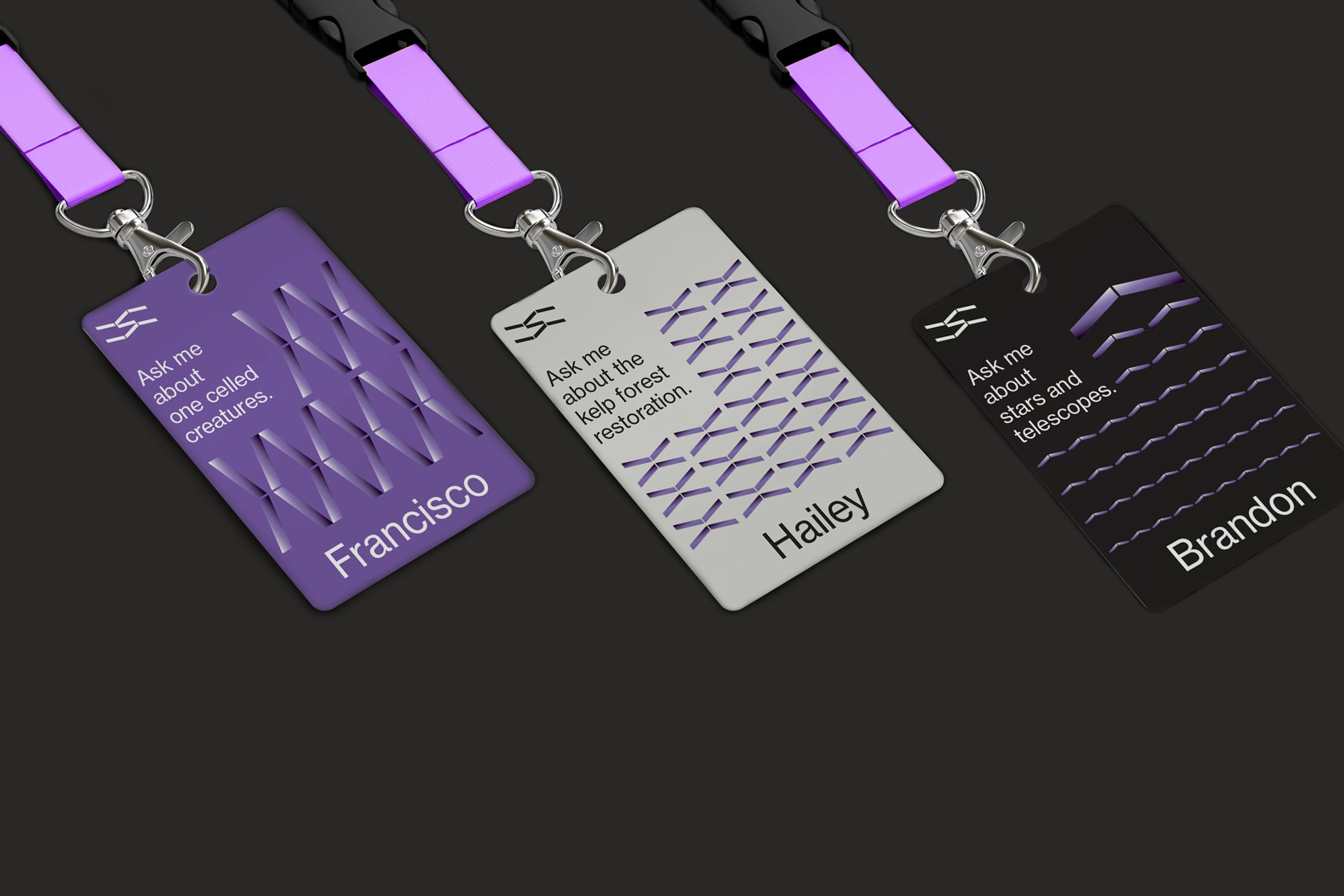
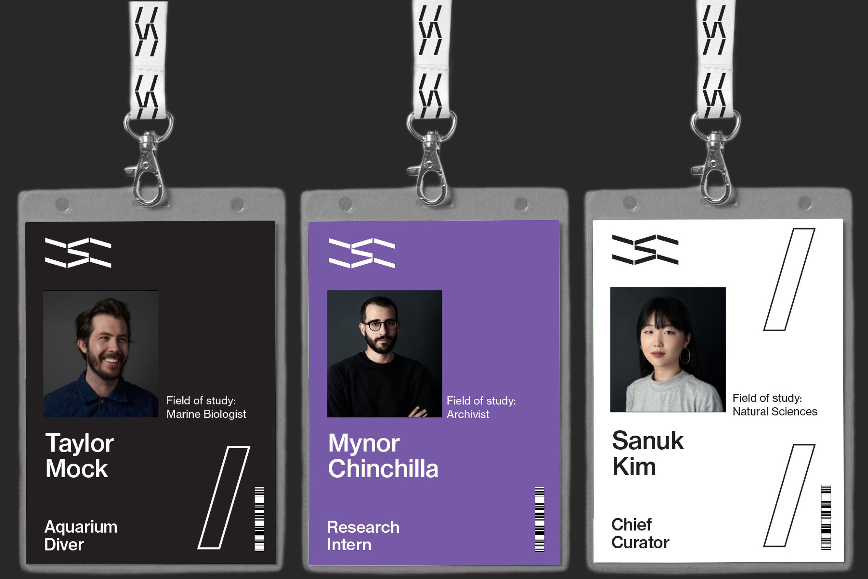
ID Badges: When thinking about the badging system, the CSC is a place of academic research but also has public-facing employees. The First set showcases the public-facing system where each pattern is attributed to their assigned post. The second set is the academic / research side.
Ticketing: Tickets tend to get overlooked. When thinking about how these would function, I wanted to create a souvenir that the audience would keep as a collectable.

Take Aways: Postcards, bags, and clothing were developed to further the brand language through multiple brand touchpoints.


Los Angeles, Califas
©2018–2020